CS 449/649 Blogpost
A showcase of Team Moonshot Factory’s productivity app “Vigor”
Introduction
In Spring 2020, students from the University of Waterloo came together to study the course CS 449/649 — Human-Computer Interaction. At the beginning of the term, students split up into teams to design different mobile apps, all centered around the theme “Re-envisioning How We Live, Work and Play Beyond the Pandemic”.
Our team, Team D1, otherwise known as Team Moonshot Factory — comprised of Igor Tvorogov, Marcus Edwards, Mohammed Nafees, Sajid Mahmood and Simeng Yang — focused on the challenge of improving productivity and mitigating procrastination, in the context of both the COVID-19 pandemic as well as more generally, life, work and play.
Meeting up twice a week all semester long, we worked tirelessly on “designing and creating digital artifacts with the user in mind” to address the problem domain we were tasked with. Having now reached the end of this process, we invite you to learn more about our experiences in designing a mobile app from the ground up.
Project Goal
To provide a convenient digital aid for people to complete their daily tasks, while also promoting personal empowerment.
Modern life, with all of its technological detours and information overloading, is rife with the problem of distraction and lack of focus. Indeed, many people today, from different walks of life, face the problem of engaging in procrastination in front of a computer or a smartphone instead of doing something productive and are compounded by a waning motivation to pursue work-related tasks. The situation is further exacerbated with the worldwide COVID-19 lockdown. Forced to stay in their homes, people are faced with even more distractions, thereby contributing to procrastination and less productivity.
As university students ourselves, we are faced with constant distractions and the agony of assignments. We have experienced firsthand the difficulties that procrastination and laziness can have on our everyday lives. From these experiences and our visions of improving our productivity habits, we decided on the value proposition of providing a convenient digital aid for people to complete their daily tasks, while also promoting personal empowerment. As productivity and procrastination are not exclusive to any one group of people, we decided to generalize our app to encompass a broad spectrum of potential users across various age groups and backgrounds.
“Set about new tasks with Vigor!”
To address the two interrelated user needs of increasing productivity and minimizing procrastination, we introduce Vigor, a mobile app that helps users find their own unique, healthy optimums for productivity. Vigor aims to incentivize users to be more productive, takes into account the need for them to take breaks to avoid burnouts, and pairs them up with a buddy so that they can reinforce each others’ productivity through a social connection.
Anticipated Userbase
Before designing the features of our app, our team worked towards identifying our target users. We were able to brainstorm four personas and designed their empathy maps to characterize the main subgroups we thought our target users might fall under. As concerns with productivity and procrastination extend to people from all walks of life, we tried to reflect this diversity through our personas.
The first persona we came up with was of David Miller, a 21 year old carefree undergraduate university student who lives by his mantra, “play hard, work varies”. Although David does well with social circles and “having fun”, he is finding it increasingly difficult to keep his grades high and to find a job due to frequently being distracted from the work he should be paying more attention to.
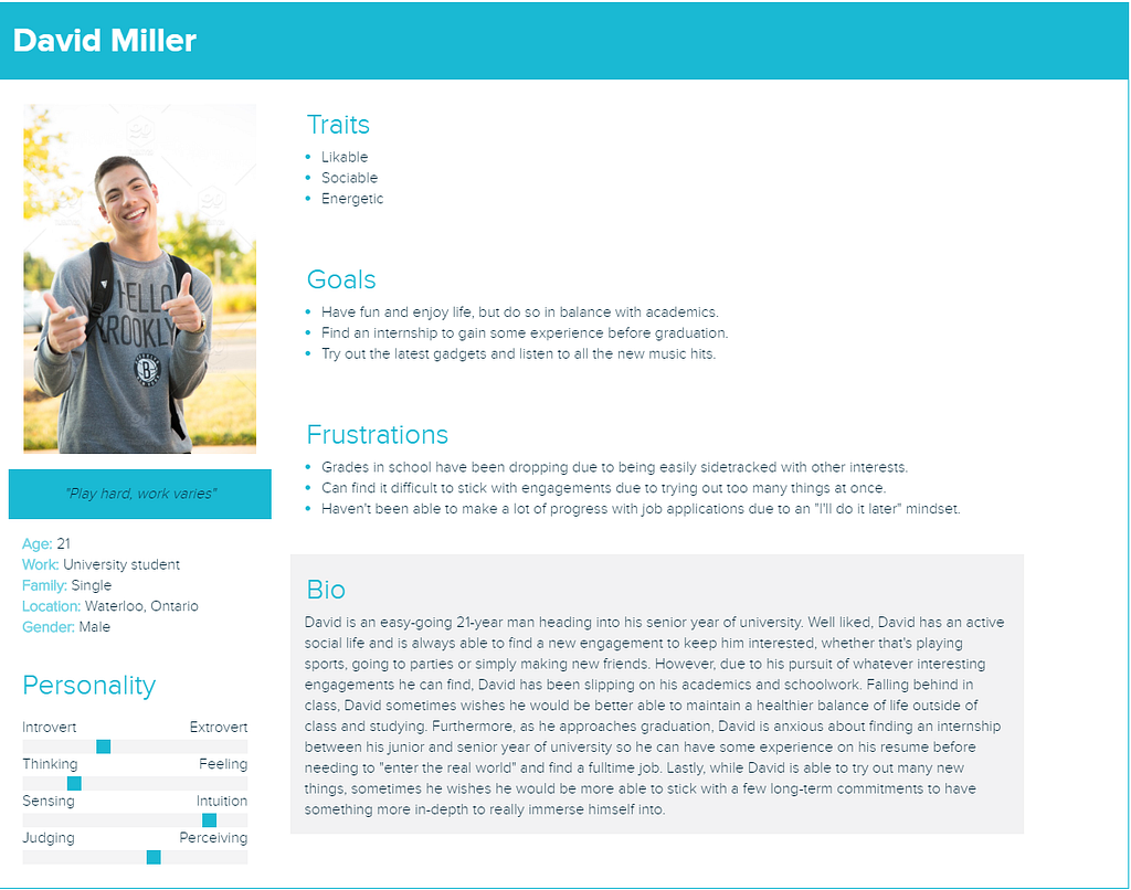
Persona of David Miller
Our second persona was that of Daniel Smithers, a bored middle-aged working professional holding a typical office job. Although Daniel is stably employed, his job demands little intellectual stimulation and does not provide career growth. At home, Daniel mostly spends his free time in front of a TV or computer screen.
Our third persona was of Varun Kumar, a hardworking recent university graduate who wants to achieve more in life. Varun likes to keep a balance between his personal and professional lives but this has also led to stress. He has not taken any proper breaks throughout his academic career and that seems to be the reason for his burnout.
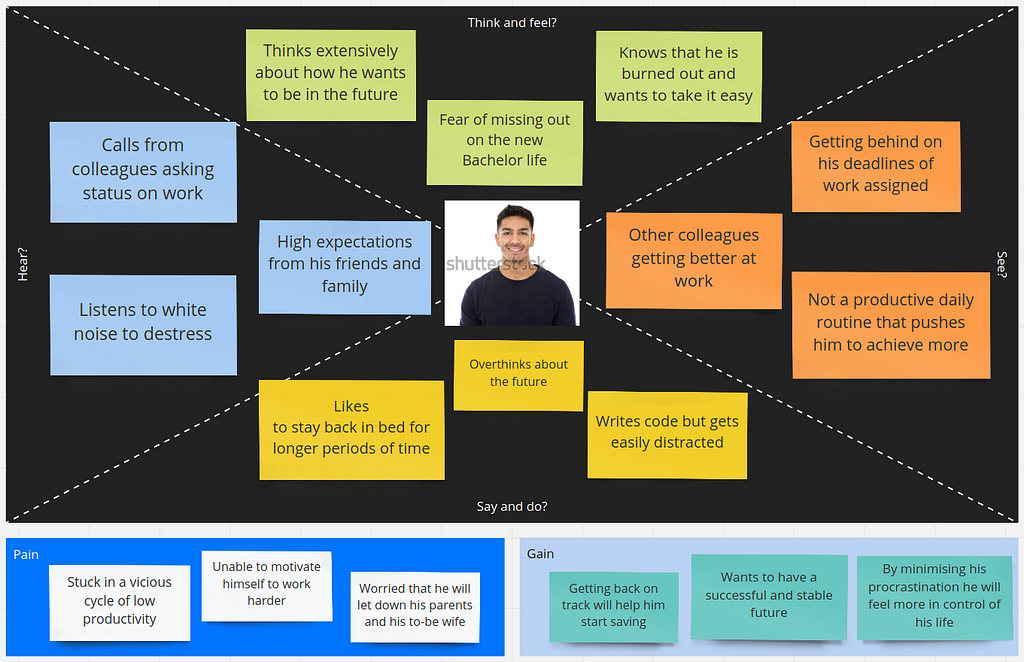
Varun Kumar’s Empathy Map
Our last persona was that of Ronald Macpherson, an older and semi-retired gentleman who has had a long career of 35 years in HR. Ronald has gotten to know the particulars of a career in human resources very well, but has lately started to become exhausted with the monotony of his work.
We were able to reflect each of the overarching subgroups our personas belonged to through our user interviews.
User Interviews
To get a better picture of our potential target users, we scouted out and interviewed 8 people across a variety of age groups and occupational backgrounds. As the personas for our target users spanned across ages from the early-twenties to the sixties and encompassed people from various walks of life, we wanted to reflect this diversity in our user interviews. Across our 8 interviewees, half of them were either still in university or had just graduated, a few of them had been out in the workforce for a number of years and one of them was in semi-retirement, in their mid-fifties. Additionally, a couple of our interviewees were female, although the majority were male. Our set of interviewees was overall very diverse and we believe it sampled our intended user base.
To more deeply understand our target users, we crafted focused sets of questions to address what goals users were trying to achieve, the arsenal of strategies they were already employing to work towards their goals and any shortcomings of those existing strategies that could be remedied to further improve their productivity and combat procrastination. After obtaining consent, each interview was then conducted one-on-one with each interviewee through either a phone call or a Zoom meeting to go over each question in detail. Although our users had a wide range of goals, strategies and shortcomings to contend with, we were able to discover some recurring themes and revealing lessons on the needs and wants of users, a few highlights of which are shared as follows.
- Having clearly defined goals and expectations is critical for maintaining productivity and fighting procrastination. Several of our interviewees stated the importance of planning out tasks conscientiously and ahead of time to ensure they stayed on track.
- Avoiding burnout was essential to staying productive for longer periods of time. A few of our interviewees stressed the need for “making a deal to relax a bit when needed, but be more productive later”.
- Breaking up large tasks into smaller pieces can make them more manageable. Some interviewees claimed that splitting up tasks into chunks could make them more achievable piece-wise and easier to schedule.
After jotting down our notes for each interview, we were able to aggregate our raw observations into an affinity diagram synthesizing the key issues and related themes imparted through our interviewees. As a team, each of us looked through the interview transcripts and summarized our findings as sticky notes on a virtual whiteboard. After doing so, we took a step back and looked with a critical eye at all the sticky notes now plastering the imaginary board. What common notions did each of us extract from the raw data? How and under which theme could they be grouped together? How could these themes be formulated to express a user wish? And which actions would these wishes amount to? These were the questions we were trying to answer, and this is the result:
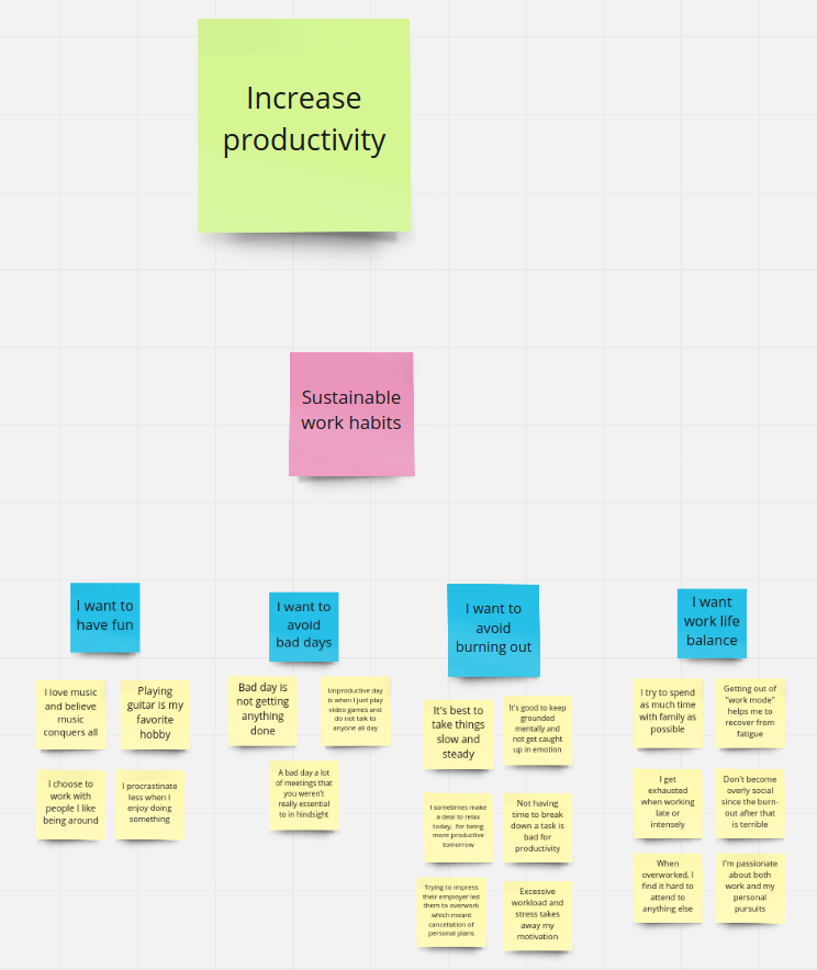
Please visit https://miro.com/app/board/o9J_krDEkag=/ to view the full Affinity Diagram
Completing the affinity diagram gave us several fundamental ideas around which we would go on to design our app’s features.
- Firstly, it turned out that anyone who was serious about their productivity used some form of written records to keep track of their tasks: to-do lists, physical notebooks, and personal Trello boards. Thus, some form of to-do list functionality would be essential to the app.
- Secondly, we had learned that taking the time to engage in favourite pastimes was essential to avoiding burnout and regaining mental strength and willpower in order to work productively. Therefore, we resolved to think about how we could encourage the user to reflect on what they enjoy doing in their spare time.
- Lastly, we also wanted to include features that would help keep track of the user’s accomplishments and long-term goals so that he or she could maintain a sense of purpose in their life.
Furthermore, our team also used work models to complement our findings which reorganized our observations in a different perspective than the affinity diagrams. We created two work models for all of our user interviews, helping us to see new insights about where breakdowns were occurring and the potential interactions between users and their environment.
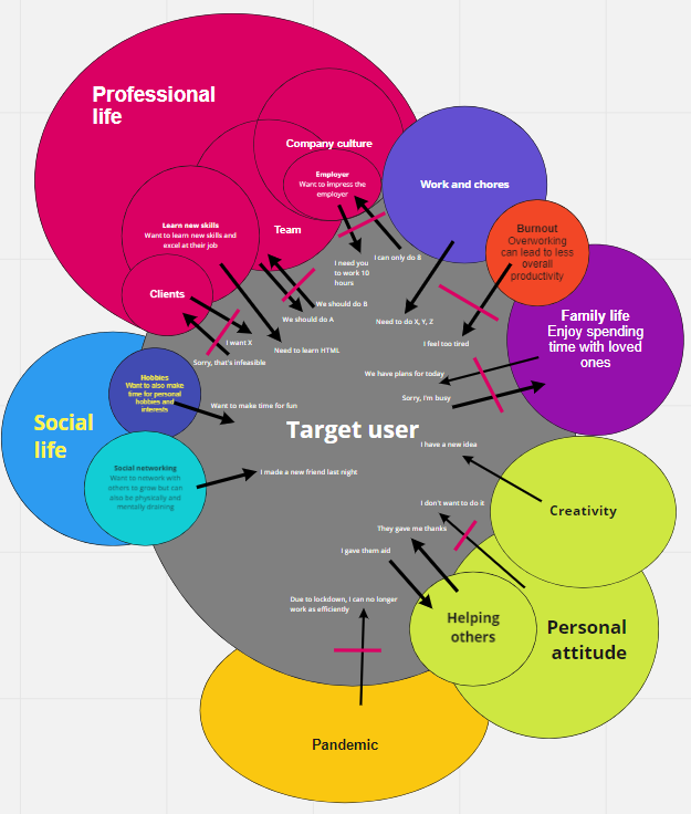
Consolidated Cultural Work Model
From our work models, we have found that the most important factor for our generalized user is professional life, with influences such as company culture, team and customers. The second most important thing for our target user is their personal life, influenced by socialization, hobbies, and family life.
We were also able to identify a couple of breakdowns and related issues to address through our app:
- One breakdown lies in the tendency towards overworking, causing burnout, resulting from a mismatch between a user’s desires to finish their tasks and their personal state of mind and energy levels. Overworking is quite common, but inevitably results in declining overall productivity if not satisfactorily resolved.
- Another area of potential vulnerability for users was the healthiness of their social life. A user’s social life undoubtedly affects, and is affected by, a person’s productive habits. Social aspects of life, like networking and hobbies, can be very potent sources of affirmation and motivation. If a user has breakdowns in their social life from poor relationships with friends and colleagues, then this could negatively influence their productivity.
We decided to tackle these breakdowns head-on by incorporating a break reminder to help users take breaks to avoid burnout and a buddy system to bolster users’ social lives through networking with a buddy user.
Initial Design Ideas
From the fundamental design ideas we came up with, we went on to think about concrete features that would be useful within the context of the app. To help complete this next stage of initial prototype design, we engaged in the design arguments activity. This activity entails thinking about specific user needs, what features would satisfy these needs, which obstacles they would help overcome, and how exactly they would be helpful. The problem examined in the context of the activity can thus be summarized in one sentence: “If we want to address a specific user need, then we are best advised to design an intervention with characteristics A, B, C that overcome obstacles H, I, J because of arguments P, Q, R.”
After engaging in a lively, stimulating discussion, we came up with the following statements, thus starting to get detailed ideas about the features we would like to include in the prototype:
- Daily to-do list — if we want the user to have a clear idea of what needs to be done to achieve their goals, then we need to encourage them to create daily to-do lists to overcome indecision on how to best pick tasks to work on, because this allows the users to keep track of what their activities are for the day.
- Rewards system to “level up” the user’s profile with “productivity points” — if we want the user to be motivated, then we need to reward the user for sticking to their tasks, such as with a points system attached to their user profile for tasks completed, to overcome discouragement from committing to their plans because this motivates them with a sense of accomplishment.
- Automatically sort the tasks for the user based on the deadlines and user-specified priority metrics — if we want the user to intelligently work more efficiently and meet deadlines on their daily tasks, then we need to enable them to create and rank priorities based on the user’s deadlines and ease of achievement, to overcome difficulty on meeting deadlines because this will help ensure they are able to fulfill their plans for working on their tasks.
- Task breakdown helper — if we want the user to not feel overwhelmed by the amount of their work, then we want to allow them to split up their work into more manageable bite sized pieces, to overcome the frustrations and mental fatigue of being overloaded because this will help them more steadily and incrementally achieve progress towards their overall goals.
- Break reminder — if we want the user to not become too tired from their work, then we want to remind them to take breaks periodically to avoid burnout from overworking because this will ensure they have a healthy physical and mental state for working sustainably.
Having got concrete ideas we could work with, we unleashed our inner artists as we moved on to imagining the user stories.
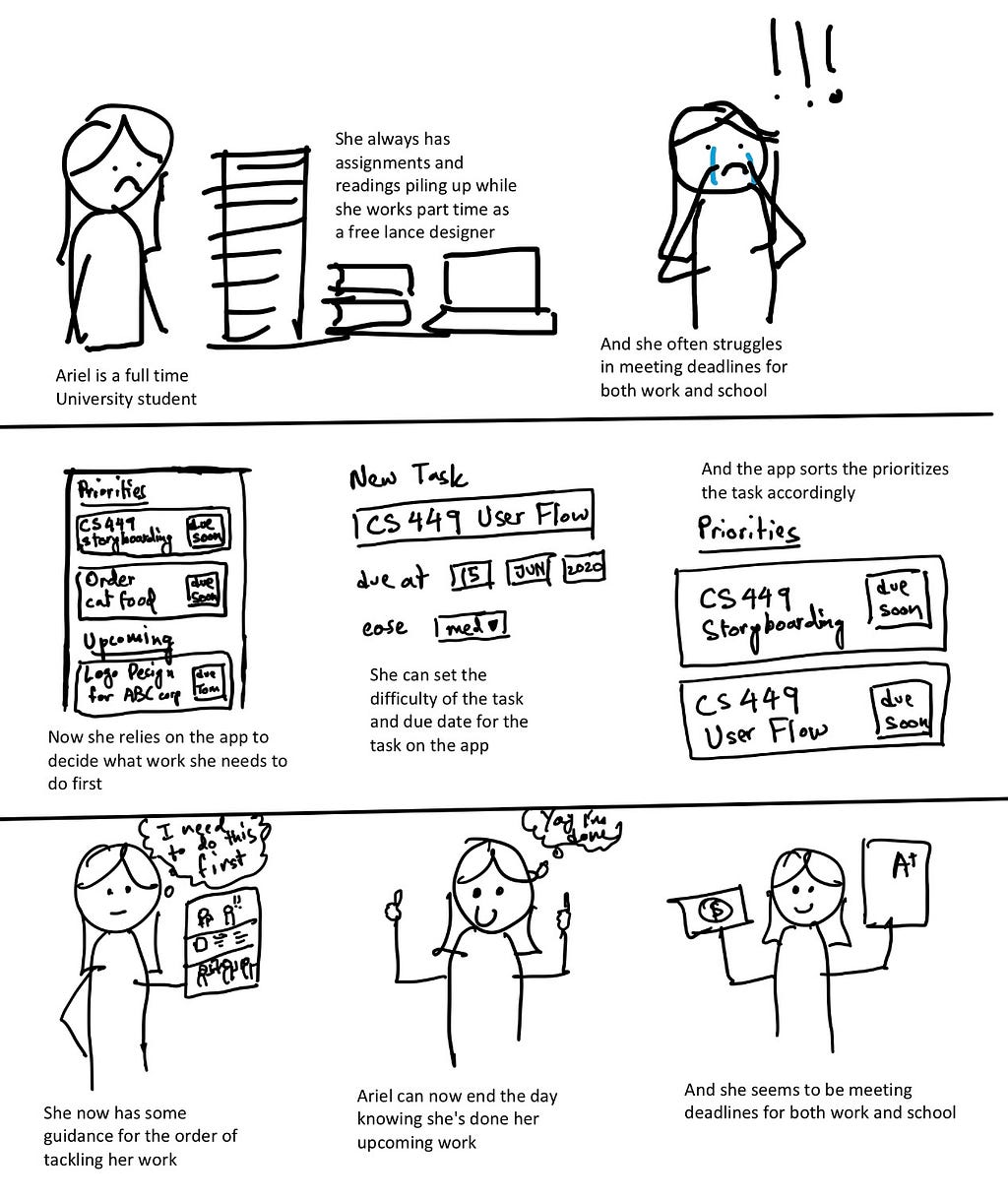
One of the User Stories
We also took to paper to design how the app’s features should look like and how the different components should work together.
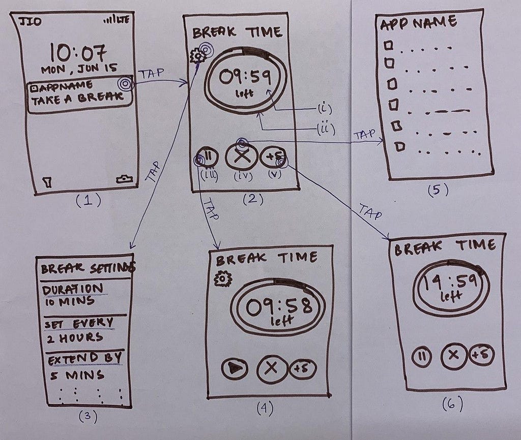
Sketch of the Break Reminder feature
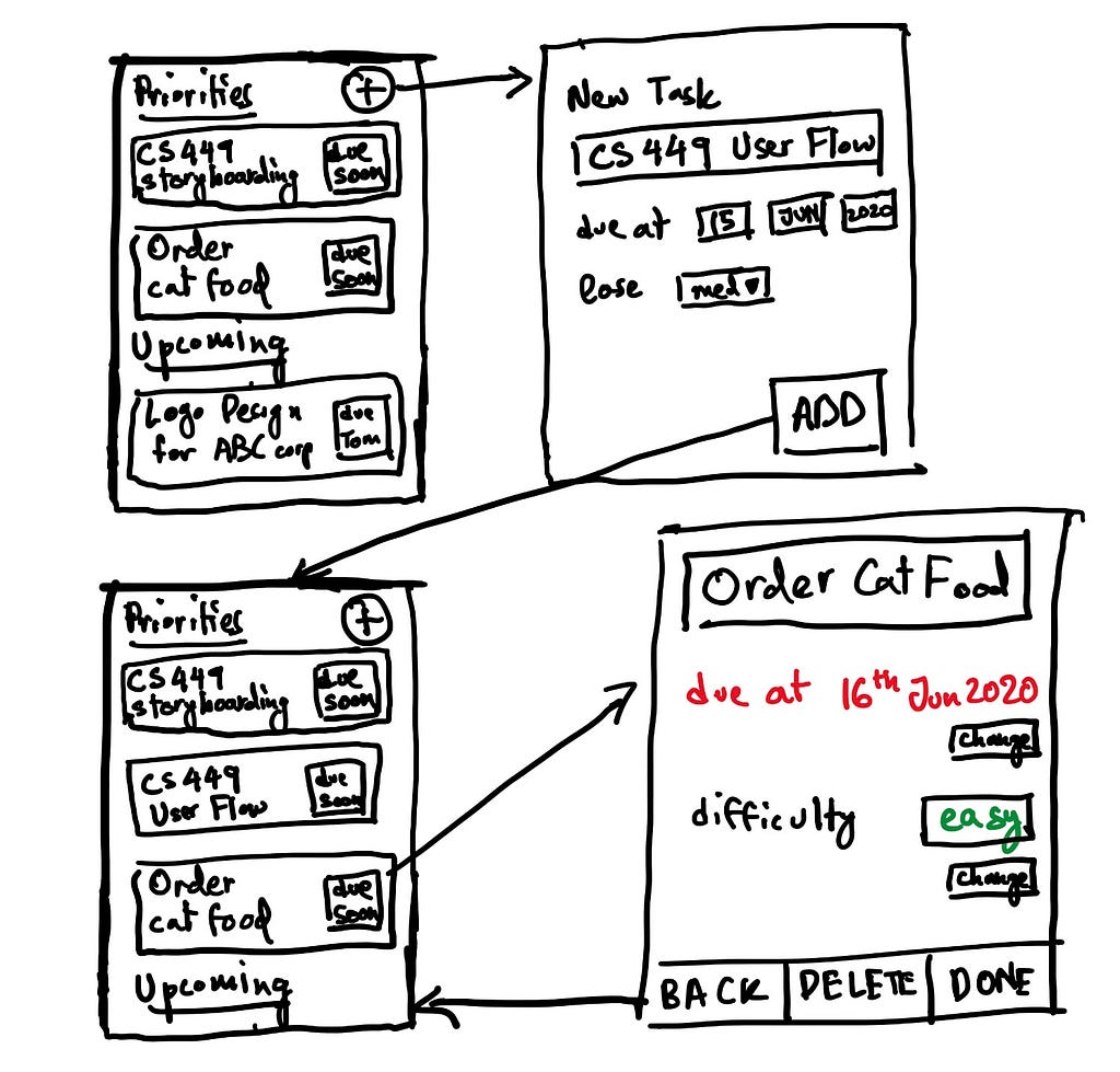
Sketch of the To-do List feature
Paper Prototypes and Evaluation
After coming up with the screen designs, it was necessary for us to test how well they would work for the users in practice. To this end, we created paper cutouts simulating the flow of a mobile app. Likenesses of screens, virtual keyboards, buttons, fields, and other UI elements were modeled with paper. A script was drafted outlining the goals the user would be asked to complete and detailing how the app would respond to the interactions.
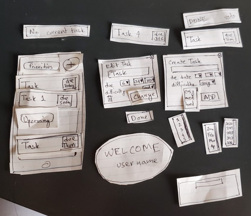
Paper Prototype of the Task Prioritizer
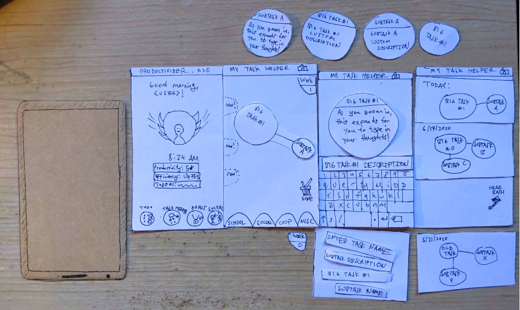
Paper Prototype of the Task Breakdown Helper
Work was split between the team members to create the paper prototypes for the features we came up with during the design arguments activity. After the prototypes were created, we conducted several evaluations with people outside the project team. The participants would indicate elements they “interacted” with, while the evaluation host would swap the UI cutouts based on the user prompts. While testing the usefulness of the features was important, the focus at that point in prototype development was more on testing the usability and intuitiveness of our UI design.
From the prototype evaluation sessions, we were able to gather feedback that helped us make useful changes to the paper prototype designs. Some changes were to the UI elements, their look-and-feel and positioning, while others were to the script and the details of the prototype flow. Three evaluations were conducted for each feature prototype, adding up to a total of fifteen. This allowed us to smooth out most of the bumps in our design, which would later give us more confidence going into the high-fidelity prototyping stage.
Design Iteration
The design of our app underwent significant changes from the insights and suggestions given by evaluators for the paper prototypes, alongside suggestions from peers in an earlier class presentation.
During a class presentation, there was much excitement over the idea of peers keeping one another accountable, which was further supported when mentioned in our paper prototype evaluations. Thus, one of the key changes we decided to incorporate was a buddy system to allow sharing and affirming productivity achievements between users, through both a view of the buddy’s recent activity as well as through chat. Buddies were randomly pre-selected to be on similar productivity levels to maximize compatibility and, if a user wished to be paired with a different buddy, they could simply press the refresh icon above their buddy’s profile picture. The final rendition of the buddy system is shown below.
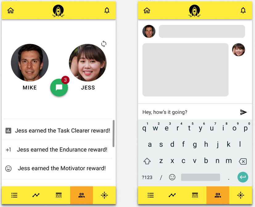
The Buddy System
Some of our evaluators mentioned how the dissimilarity between the paper prototypes for the to-do list and the task prioritizer could be a bit disorienting, despite the screens being very related. To improve consistency, the interface of the to-do list was redesigned to better mirror the interface of the task prioritizer, treating the to-do list and task prioritizer as essentially alternate and switchable views for task planning.
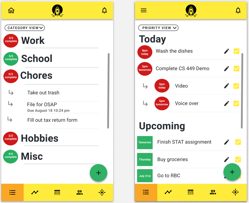
The resulting designs for the to-do list as the category view (left) and task prioritizer as the priority view (right)
A few of our evaluators also commented that the mechanics of creating and deleting tasks for the task breakdown helper didn’t make the most sense, as the task breakdown helper was purposed towards breaking down existing tasks. Based on this feedback, we decided to scope down the abilities of the task breakdown helper for only adding, editing and deleting subtasks, while preserving the ability to edit tasks based on their subtasks. A picture of the revised task breakdown helper is shared below.
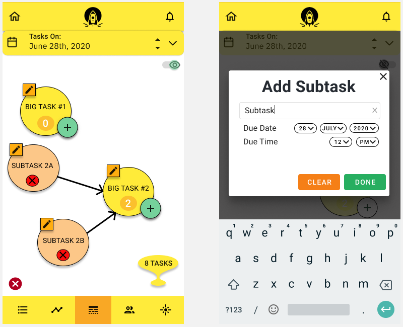
The Revised Task Breakdown Helper
Ultimately, with the changes to our app over multiple design iterations, we were able to expand the functionality of our app, improve its consistency and reduce some pain points of the user experience. Moreover, on the more human side, we also learned valuable lessons to embrace change boldly and to not shy away from constructive criticism.
High-Fidelity Prototypes and Evaluations
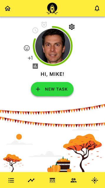
The home screen of Vigor’s high fidelity prototype
During the last few weeks of the course, we worked on the high-fidelity prototypes for our app, incorporating the feedback we had received from the evaluations for the low-fidelity (paper) prototypes. We designed our high-fidelity prototypes using Figma. To make our design process easier and to bring more consistency throughout the app, we chose to use the Material Design language. Our evaluators of the high-fidelity prototypes welcomed this since it considerably reduced the learning curve because they were already well versed with using apps that used Material Design.
Just like the low-fidelity prototypes, we divided the work amongst all 5 team members to design Figma prototypes for each of our app’s features, mostly by converting the low-fidelity prototypes into actual Material Design prototypes. Since we wanted our app to feel lively and become a driving force in our user’s life for efficiency of managing tasks, our team decided to use a yellow-orange-green color palette.
For the evaluation of our Figma prototypes, we conducted both synchronous and asynchronous evaluations with users. To be able to do this, we created a Figma presentation connecting all the different app screens with each other through click interactions. These evaluations were divided into heuristic evaluations and cognitive walkthrough evaluations. The evaluators were asked to do 3 simple tasks in the app:
- To use the to-do list of the app
- To interact with the buddy system of the app
- To use the task breakdown helper to navigate around subtasks and bigger tasks in the app
Heuristic Evaluations
- Visibility of system status — We wanted the app to keep the user informed about what is going on. Some of the feedback that we received for this heuristic was to show a notification to the user when a task is successfully created, as well as to add more tooltips for actionable items.
- Match between system and real world — The app should follow real-world conventions in delivering information to the user. We mostly received positive feedback for this heuristic and the users were able to navigate around the app with ease.
- Consistency and standards — The user should be able to use the app without having to first learn new conventions. This was again very nicely implemented in the app as was evident from the evaluations. The evaluators seemed to like the consistent design across all screens and the use of the Material Design language, which they were already familiar with.
- Recognition rather than recall — Users should be able to recognize actions they can take without the need to remember what they had done in a previous screen. There was some confusion regarding some of the icons in the navigation bar used and what they stood for.
- Flexibility and efficiency of use — By using accelerators, power users can carry out tasks at a faster pace thereby increasing their efficiency. Material Design language’s use of a bottom navigation bar was utilized in our app which acts like an accelerator and enabled our evaluators to navigate to the different screens of the app. Having a dedicated button to add a new task in the home screen seemed to also add to the UX of our evaluators.
- Aesthetic and minimalist design — The UI should look classy and should not be cluttered with unnecessary components. All of the evaluators agreed that the design is very minimalist which makes the UX a pleasing one.
Cognitive Walkthrough Evaluations
Cognitive walkthrough of the buddy system feature
During the cognitive walkthroughs, the evaluators were asked to carry out the tasks mentioned above while we synchronously observed what they were doing. All the evaluators could easily navigate through the app with almost no hurdles faced while following our instructions to carry out the tasks. They liked the color scheme and the use of Material Design.
Some of the feedback we received was about the navigation bar’s inconsistency in some screens. This was, however, due to the fact that the Figma presentation was specifically designed for a walkthrough evaluation. In the actual app, the navigation bar would fully be working. Other feedback mentioned that the buddy system could be a distraction instead of an aid, which came as a surprise to us, and that the break reminder could be sometimes confusing to use.
Feedback-based Future Design Changes
We received some very insightful feedback and we hope to bring about the following changes for future iterations.
- The on-boarding process should have a tutorial-like feel to it where the user is introduced to the various sections of the app.
- The break reminder should have a better description in the on-boarding process to let the user know exactly what it is meant to be.
- Instead of matching buddies randomly, the app could possibly have the ability to “buddy up” with users through a unique URL and/or QR code. This could also pave the path to have invite links in the app.
- Given the privacy concerns of users, the chat feature should be optional. Additionally, the buddy system as a whole can be made an optional feature.
You can view our final working high-fidelity prototype below.
https://medium.com/media/b15ff54b1b5156bc95fba0a3f2f2def4/hrefConclusion
Looking back, although a few of us may have entered this course as complete novices at Human-Computer Interaction, we have since emerged being much more wizened in designing effective user interfaces. Throughout this course, we were trained in many dimensions of the design process as we trekked a long, yet instructive and enjoyable journey towards our final app design. We started out on a good foot with personas for our target users and user interviews to chart our trajectory, before taking off with paper prototyping in the earlier designs of our app and finishing our journeys with a satisfying high-fidelity prototype, all with constant feedback from peers and outside evaluators to ensure we stayed on course.
Based on our final set of evaluations, it appears that our app does indeed do a good job of helping users to improve their productivity, while also combating procrastination. In fact, a few of our evaluators even said they were excited about the prospect of turning our prototype into a real app they could install and use personally! However, design is a road that never ends and there is certainly much room for improvements to our app. In retrospect, if we could repeat our journey on this road, we would have likely been able to arrive at a more cohesive design of our app earlier on had we approached our features more holistically from the beginning, rather than in isolation. This would have ensured that, for instance, our to-do list, task prioritizer and other features were better integrated from the start of the design process.
Finally, from the challenges we undertook in designing our app, we also learned to work effectively as a cross-functional team with diverse talents and experience to create a better final product. Aside from being able to more intricately appreciate the nuances of design, we truly realized the adage that the whole is greater than the sum of its parts!
Signing off,
Team D1 — “The Moonshot Factory”
Originally published on medium.com.